Clarity is a tech company specializing in digital services and transformation for primarily DoD and IC.
Clarity has come a long way from its inception in 2012. We’ve grown in a number of ways. In size, in diversity, clients, and our processes.
Our previous logo was a 3rd parties’ interpretation of what Clarity was—bold, clean, a blue gradient to represent our reliability in tech, and the C and I for further transparency.
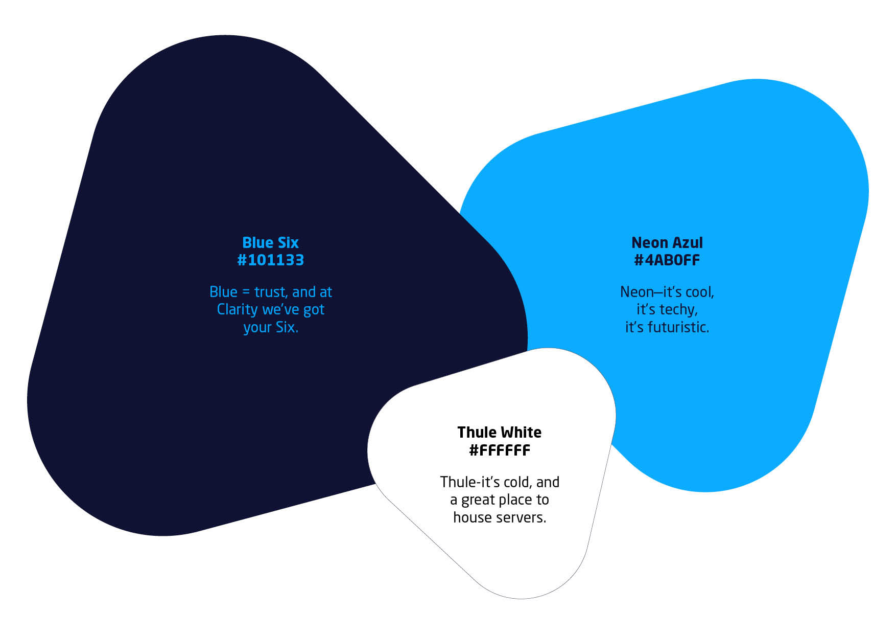
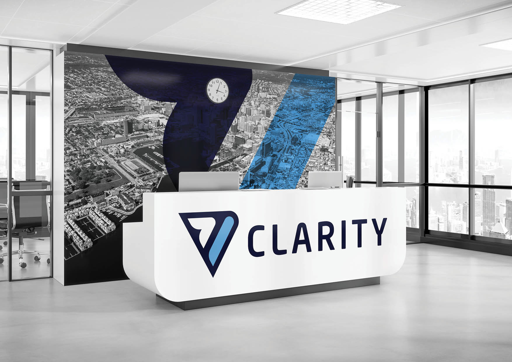
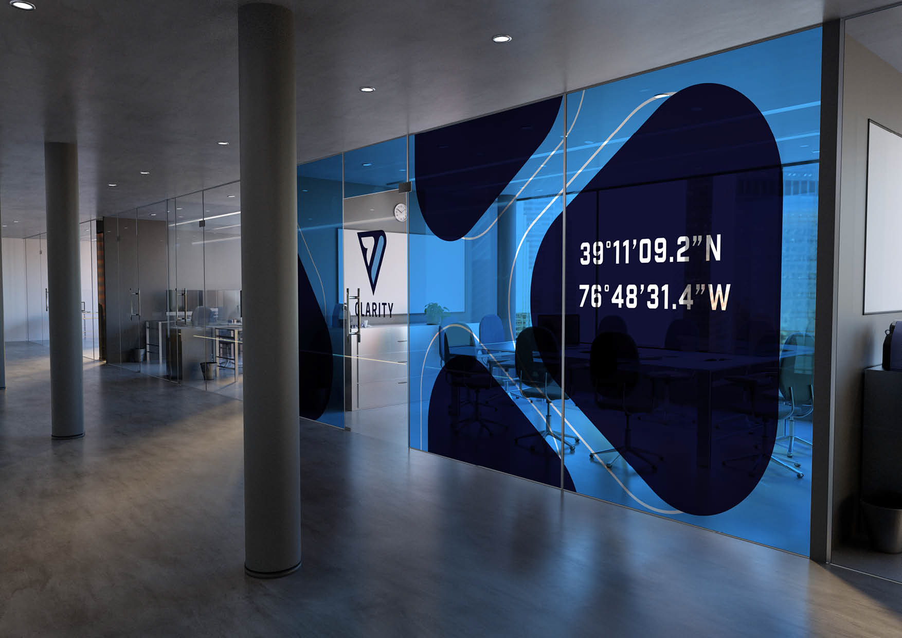
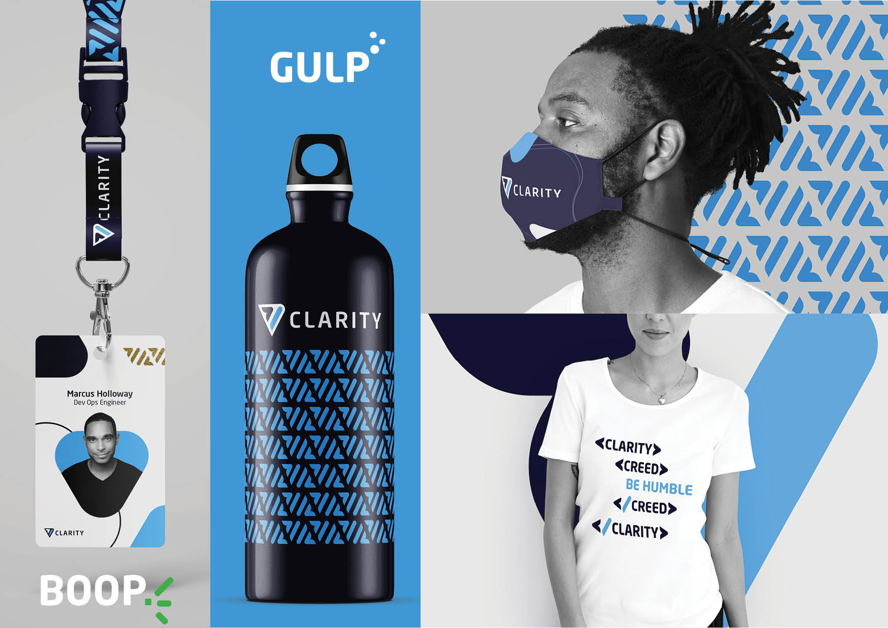
Fast forward to 2021, our internal design team took on the task to redefine what the Clarity brand can be with 1st hand knowledge of Clarity’s culture. We’re a tech company, which is why the first thing you’ll notice is the greater than and forward slash symbols. These symbols are housed in a triangle which represents change, growth, motion and direction, which for us, is forward. We continued the tradition of using blues to communicate trust, reliability, and cutting-edge technology. We’ve also made a name for ourselves in our industry to the point that people refer to us as “Clarity.”
Our new logo is a reflection of who we are, what we do, and where we are going. We are a tech company. We are always moving forward. We are Clarity.